ListVisualizer helps your accumulated data in SharePoint represent in a visual format, thereby enabling you to reveal the hidden insights quicker. List Visualizer is a SharePoint-based add-in, which helps you in rephrasing your data in various visual formats like colorful charts, simple graphs and bar diagrams, and also helps you to filter and group your data as required. List Visualizer is an intelligent add-in which eliminates the need to export your data to third party data sheets to create such visuals, thereby reducing your overall time and efforts and thus boosting productivity.
Introduction to ListVisualizer
Play Video
Snapshots of the ListVisualizer
Features
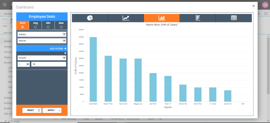
Bar Graph
While representing larger data sets, you can opt for a Bar Graph option in ListVisualizer. Bar
Graphs further improve the readability of your data and is useful for data sets with multiple
entries.
Column Graph
For smaller data sets and data sets with negative values, ListVisualizer has the ability to convert
your data into a colorful Column Graph for better visibility and easy representation.
Line Graph
ListVisualizer takes your complex and bulk list data and smartly converts it into an easily
readable Line Graph, enabling you to easily compare between multiple data points.
Pie Chart
ListVisualizer aids you to summarize your mass
data into a colorful Pie Chart which enables you to visually check the accuracy of your data, all
with no or minimal additional explanation.
Simplified List
ListVisualizer enables you to sort and filter a simple List View from your bulky data for effective
data management and lets you focus on the filtered data points.